
Korko Collection
Made by nature
project developed for Korko
New line
development
Renewable material
for sustainable toys
Product
optimization

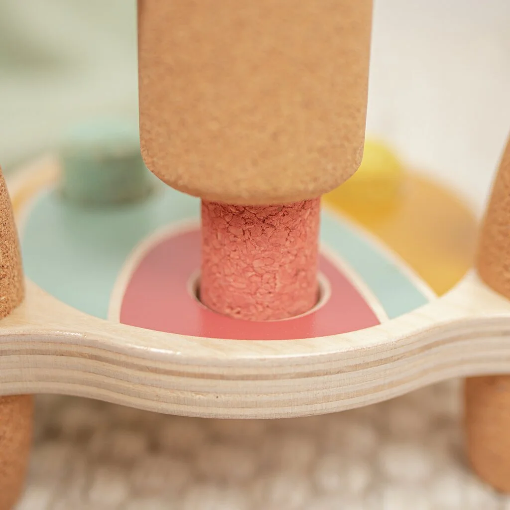
Designing with cork
Exploring the natural qualities of a sustainable material
The projects we developed for Korko began with the company’s ambition to offer sustainable toys, built around cork’s remarkable properties:
Soft and quiet material
Lightweight
Anti-bacterial qualities
With this in mind, we focused on transforming these features into the foundation of the play experience, creating designs that spark imagination and encourage learning.
Our contribution

Research
Strategy

Concept

Identity

Design

Development
Communication


behind the scenes
~
behind the scenes ~
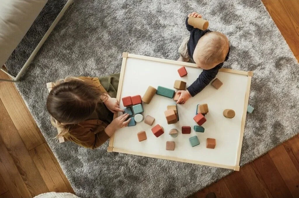
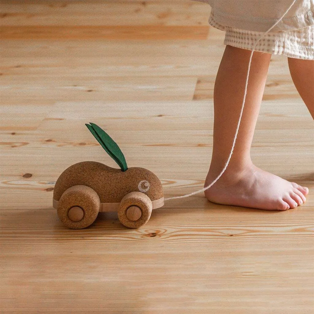
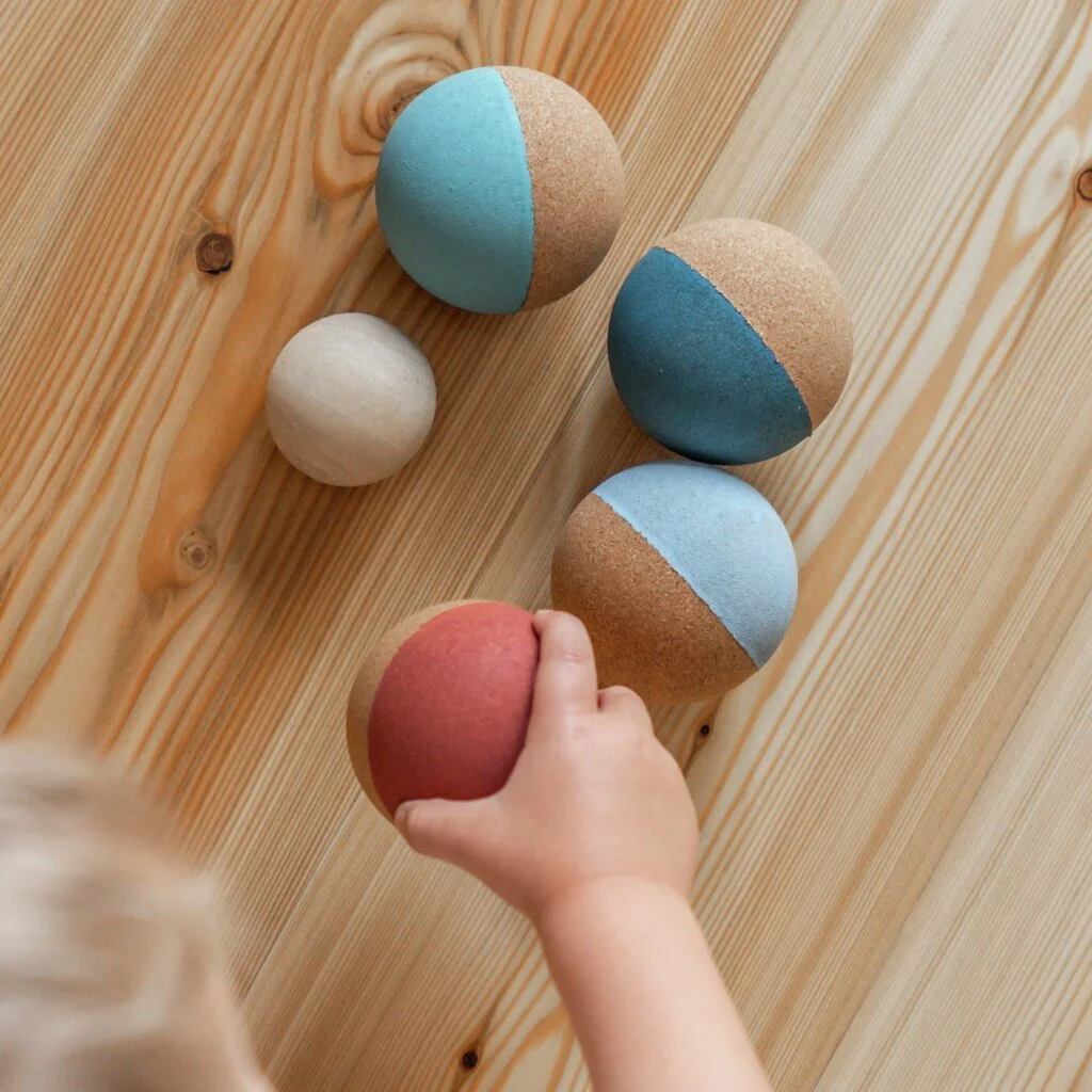
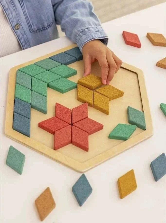
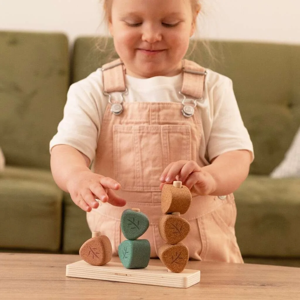
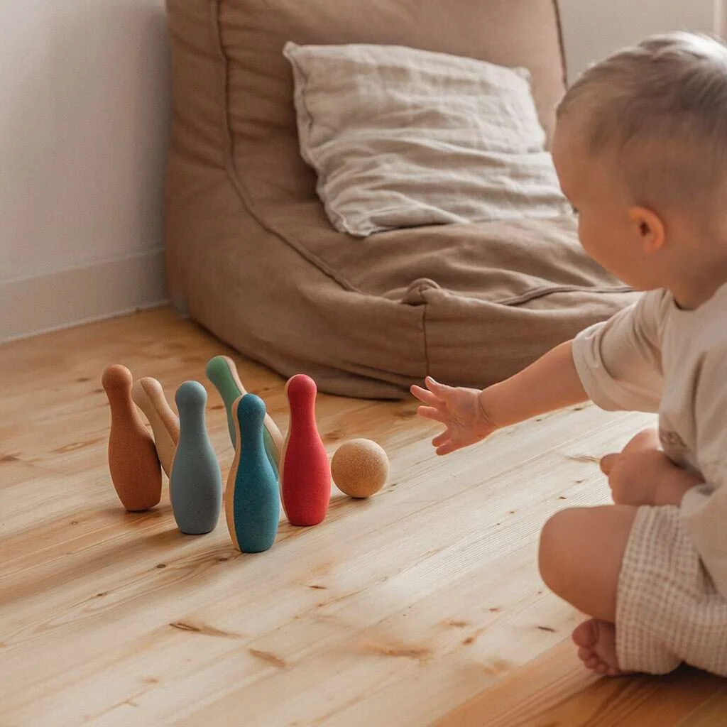
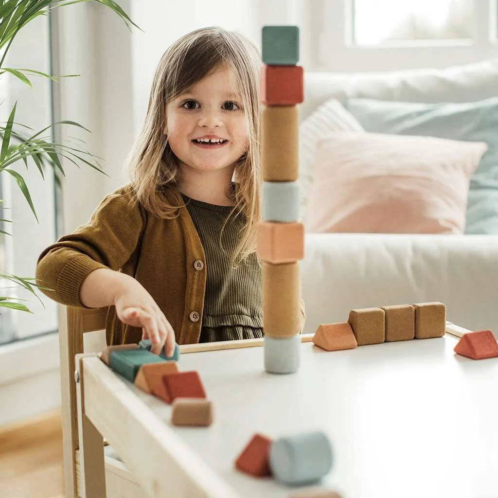
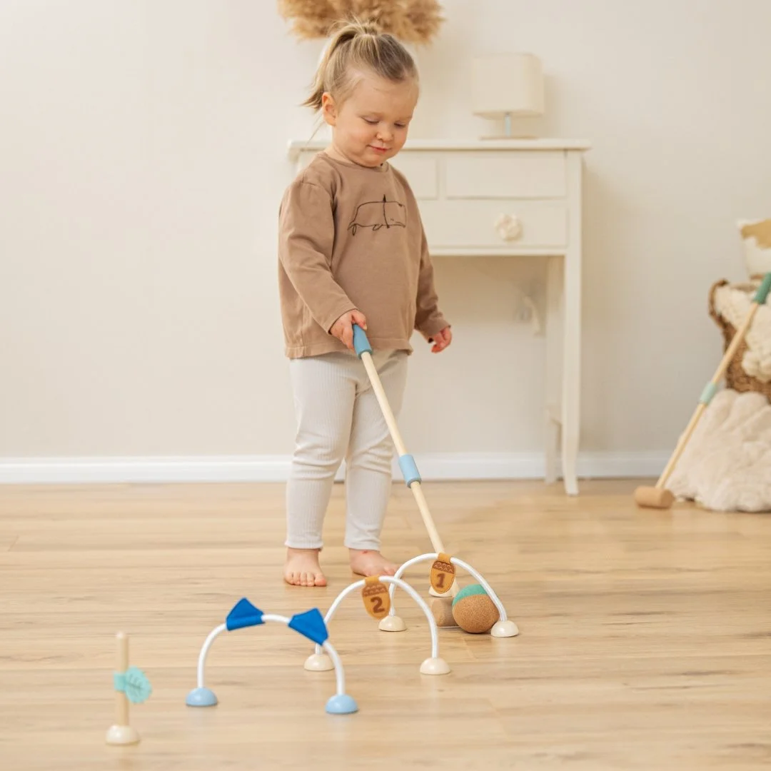
A soft & quiet toy line
From the outset, cork proved the perfect match for developing a toy range for toddlers. The first collection focused on classic toys that could be enhanced by the material’s unique qualities. These toys supported children’s mental and motor skills safely, while also delighting their sense of touch with cork’s soft texture. For this collection we fully developed some products, and for others, we cooperated on the graphics.
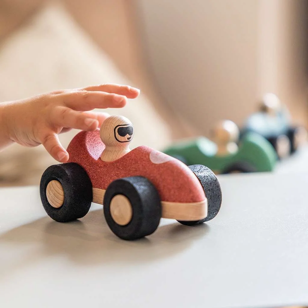
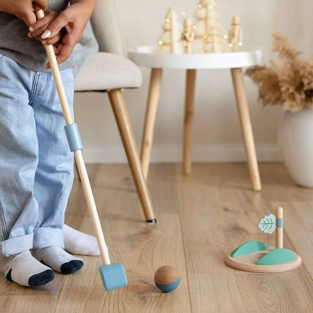
Over time, we extended the designs to older age groups, exploring the world of movement with toys such as golf and croquet sets, making the most of cork’s lightweight and sound-absorbing properties.
Cork does, however, present certain limitations in production and design. Rather than treating these as obstacles, we embraced them as opportunities to shape creative solutions.


Visual identity, naturally inspired
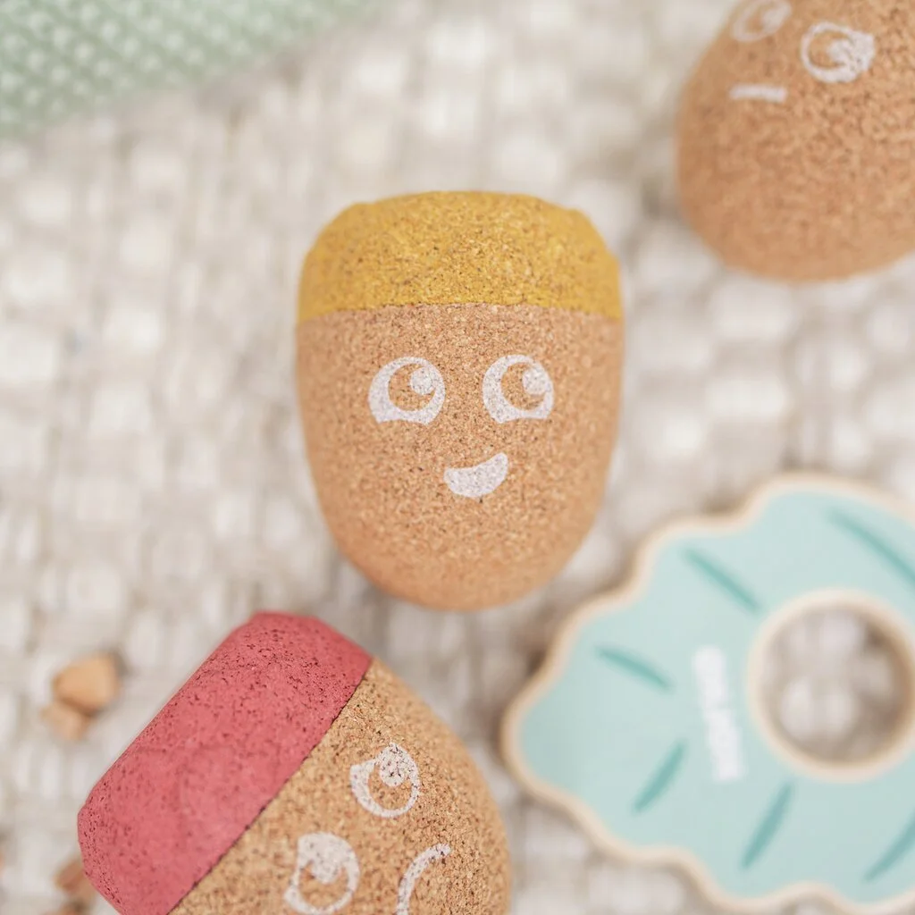
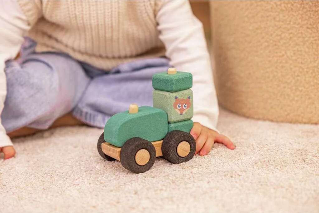
We also collaborated on defining the brand identity. With its strong environmental focus, both in communication and in its products, we drew inspiration from Portugal’s cork forests and chose the owl as the brand’s mascot.
That’s how Coco was born: a soft, quiet owl featured in the toys, who also guides the brand’s communication both online and on packaging. Alongside Coco, we created his forest friends, the hedgehog, fox, and bear, who appear in the products as playful companions to add variety. The illustration style is soft and rounded, creating a calm and reassuring effect.
The colour palette follows the same principles of softness and naturalness, blending harmoniously with the natural tones of wood and cork, while appealing to the target age group of children.

Main colours

The friends
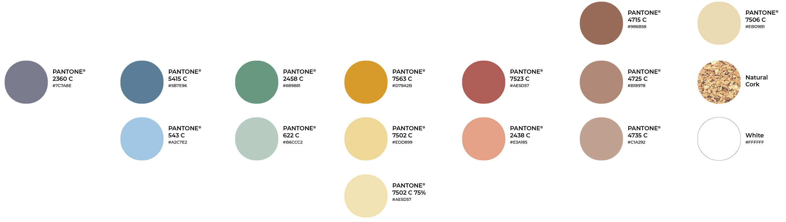
Colour palette
The Full Collection

Credits: Digital Images from Korko